NYU Large Scale Machine Learning (Big Data) Lecture One: Online Linear Classification

I’m very fortunate to be auditing Yann Lecun and John Langford‘s new big data course at NYU. Their personal web sites might not win any design awards, but they certainly have no shortage of expertise in machine learning – and people know. It was standing-room only in lecture hall 101 at Courant. I think a number of students accepted the offer from professor LeCun to sit on the ground in the front. LeCun’s introduction to the course included a variation on Drew Conway’s “Data Science Venn Diagram” – Drew Conway was in the back of the room. The professors are planning to bring in some other guest lecturers, and the class is also going to get to use a hundred-node Hadoop cluster donated to NYU by Yahoo!.

It was an exciting atmosphere! What follows are my possibly opinionated, possibly incorrect, definitely selective notes from the class.

We’re using N for the dimension of vectors and T for number of training samples, which is not the notation I generally think of. I’m used to using N (or n) for number of observations. Maybe this other convention is a standard among machine learning people? Anyway, imagine a matrix with N dimension (feature) labels across the top and T training example (observation) labels down the left side. LeCun didn’t draw this out, but he did specify these cells contents in his presentation:

small N large N
small T hell!
large T great!
infinite T on-line/streaming

I might fill in those empty cells as follows:

small N large N
small T statistics hell!
large T great! also hell?
infinite T on-line/streaming also hell?

And I guess we never go on systematically adding more features forever in the same way that we systematically go on adding more data forever.

After the introduction by LeCun, Langford took over for the main lecture, about on-line learning for classification. (I was going to specify supervised, but apparently this is redundant.) As they were switching computers, we could see that Langford was running Outlook in a Windows VM on his laptop – maybe that’s the price you pay when you work at Microsoft Research? The real demonstration tool of choice is Vowpal Wabbit, which is the creation of Langford himself. Maybe I should call it the reference implementation. As you can see on the published slides for the lecture, the first directions were to clone and make vw from github. Of course make just failed on my Mac and I didn’t have time to figure out why. It wasn’t really necessary to have vw to follow along, but I should really get that to work… I did feel, throughout the lecture, that I was much better off for previously having seen Langford give a talk about vw at the NYC Machine Learning meetup back in September of 2011. Of course it also helped that he was being much more didactic in his presentation.

It wasn’t long before the mathematics was enough to keep me busy and I was typing a good deal less. There were also lighter moments, as for example when Langford enjoyed getting in a little rip against Mahout, which it seems is often much slower than his vw. If it’s really true that the biggest data set they even try to crunch is processed in about a second on his laptop in vw, I guess that’s fair!

Langford spent most of his time talking about choosing a loss function and online learning generally. I hope we get to hear more in the future about how vw uses hashing to achieve its speed. I kind of think this must not be that complex a topic, but I’d like to understand it better.

The discussion of what loss function is appropriate was the best didactic component of the lecture, in my opinion, as Langford gave the whole room time to think about and suggest what should be used for a range of scenarios. You can see this in his slides titled “Know your loss function semantics”, but I think it was much better experienced in the room, at least for me, since I don’t instantly know the answers to that type of question. And as Langford says, “one of the most common ways to mess up in machine learning is to optimize the wrong thing.” I thought the example of house sales was especially interesting, because the solution involved a consideration of the weirdness in the data coming from non-market home sales between family members and such. I hadn’t considered that.

There was also some discussion of how to best deal with the often varying importance of different types of failures. (It is much worse, for example, to mark non-spam as spam than to mark spam as non-spam.) I asked a question here that I think, in retrospect, must have been already understood by many people in the room. Langford’s response was clear and helpful. He’s clearly both intelligent and kind, and sometimes even funny. His response to another question: “Recall and precision… Those always confuse me. Yes, certainly you want something that is good.” He did go on to resolve the issue, which I think may have been that recall and precision weren’t particularly relevant to the discussion at hand at that time. He also artfully addressed a student question that suggested a method that would break information causality, so to speak. Really good stuff.

There was some discussion of how best to adjust learning rate, a recommendation for per-feature learning rate decay, and Langford also advocated gently for progressive validation rather than (or maybe just in addition to) train-test validation for on-line learning. I had never seen z-scoring referred to as “Gaussian Sphering” before. Both sound pretty cool. I mean the names. Both names are good. But of course the way Vowpal Wabbit does variable normalization is way smarter.

Very good stuff! I’m definitely looking forward to next week.
Visualize co-occurrence graph from document occurrence input using R package ‘igraph’

Co-occurrence can mean two words occurring together in the same document. In this case there are likely to be very many words total, and the following visualization will not necessarily be sensible without judicious data trimming. However there are other cases, for example perhaps the occurrence of two full texts in the same manuscript produced by a scribe in the middle ages, in which the universe of items is reasonably small. In any case where the universe of co-occurring items is fairly small, the following visualization technique might be useful.

For the running example, consider a corpus of three sentences composed of words:

the fat
the cat
the fat fat cat

One step of pre-processing is required: make a table with one column for every element that appears in any collection in the corpus and one row for every collection in the corpus. (It might be done programmatically in some cases, but this will remain outside the current scope.) The values of the table are counts of how many times each element appears in each collection. In some cases this can be a reasonable format even for human-entered data. Load the data into a data frame in R. You probably want to store your data in a separate file, but for convenience we can continue the example:

data <- read.table(header=T, row.names=1, text=
"    the fat cat
 one   1   1   0
 two   1   0   1
 three 1   2   1")

Later we will want to use the number of times each word occurs, so get that now, and prepare to start doing matrix things:

total_occurrences <- colSums(data)
data_matrix <- as.matrix(data)

We want a co-occurrence matrix, which has rows and columns both representing the words (elements) that occur, and the values in the matrix representing the number of times that the elements occur together in the same collection. This is easy to calculate thanks to the nature of matrix multiplication. (You may want to alter the data_matrix by making all entries zero or one, which is easily done with data_matrix <- pmin(data_matrix, 1), because multiple occurrences of the same elements in the same collection lead to multiplicative results; “the the the cat cat” counts as six co-occurrences of “the” with “cat”.)

co_occurrence <- t(data_matrix) %*% data_matrix

If you don’t have igraph installed, install it. It’s as easy as install.packages("igraph"). We’ll load it and build our graph object.

library(igraph)
graph <- graph.adjacency(co_occurrence,
                         weighted=TRUE,
                         mode="undirected",
                         diag=FALSE)

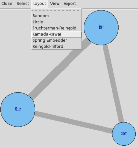
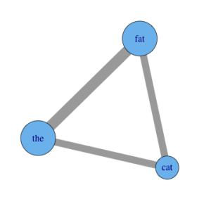
That’s the extent of the setup! You can start looking around immediately with commands as simple as plot(graph), but you probably want to change some of the display parameters to make the size and color of the visual elements more meaningful, or at least customized. For example, after set.seed(3) for reproducibility:

plot(graph,
     vertex.label=names(data),
     vertex.size=total_occurrences*18,
     edge.width=E(graph)$weight*8)

graph

You’ll have to experiment with tweaking the option values. You can use mathematical transforms other than just multiplication as well, of course. Other options you may want to add include vertex.color, edge.color, and layout. See R’s help for igraph.plotting, but also be sure to play with tkplot in place of plot, which gives you an interactive environment to change things in. It’s a good place to try different layouts and just move things around in to explore.

graph

For much more, you can always check out the igraph web site. Their screenshots will quickly give you an overview of what else is possible.

1,236 multiple-choice MCAS math items

The items are all available on github; this post duplicates the repo’s README:

A friend and I went through all the MCAS math exam PDFs available as of January 2013 and used the Mac screenshot function to create PNG images for every multiple-choice question that didn’t explicitly require some additional resource, like a ruler. We recorded the correct answers in simple text files. This produced 1,236 items from 53 exams offered from 2007 to 2012 for grades 3, 4, 5, 6, 7, 8, and 10.

I plan to use these items in a project I’m working on, but I’d like to make them available in this format for others as well, so that the work we did is not needlessly duplicated. Thanks to the sensibleness of the Massachusetts Department of Elementary and Secondary Education, re-use is allowed. Their complete copyright message is copied at the bottom of this README.

Each exam administration has its own folder. The folders are named like s2008g10math.

  • The first character indicates when the exam is from. The spring administration (s) is when almost all exams are offered. There are also March (m) and November (n) re-tests for tenth grade.
  • The next four characters indicate the year of the exam.
  • The g is a handy delimiter meaning “grade” and the digits that follow it represent the grade level of the exam.
  • The last four characters are always math because that’s all we looked at for this.

Within each exam administration folder are a bunch of PNG files and a key.txt text file. The PNG filenames include a date and time that orders them correctly. Be careful – the correct ordering is not always produced by alphabetizing the filenames. The text file key.txt includes one answer per line (A, B, C, or D) and sometimes comments starting with a hash. Comments like “#calc” were meant to indicate the start of the exam section that allowed calculators. These are mostly correct, but I gave up caring about the calculator rules, so I’m not that concerned with whether they’re right. In my further processing I just completely ignore comments.

I am not in any way affiliated with Masachusetts or its education system. I just hope that by making these items available I might in some small way contribute to improving education overall. Use these items well!

~ Aaron Schumacher


Massachusetts Department of Elementary and Secondary Education copyright notice:

Permission is hereby granted to copy for non-commercial educational purposes any or all parts of this document with the exception of English Language Arts passages that are not designated as in the public domain. Permission to copy all other passages must be obtained from the copyright holder. Please credit the “Massachusetts Department of Elementary and Secondary Education.”